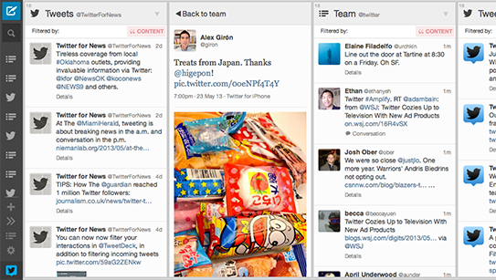
Tweetdeck fans will find some very interesting changes next time they go for their socializing rounds. Twitter’s client now features an improved UI with great features and design elements.
The interface now looks much cleaner and simple, making it much more similar to the official Twitter design. The top bar has been moved to the side, where you can now access all your functions. This gives you longer columns, and hence, more content.
You can access all your shortcuts from the bar. Abilities like starting a tweet, searching and accessing your columns are still there. One can also expand the bar to see a description of each icon (or simply hover over them). The expand button is at the botton, along with the Settings and Lists buttons.
I think it’s a nice and discrete change. It keeps the essence of Tweetdeck while merging it a little more with Twitter. I also love that my columns are now a little longer and cover more screen space. You can check out the new interface straight from Tweetdeck or the Chrome Web Store, so take it out for a roll and let us know how you like it!
[Twitter]
