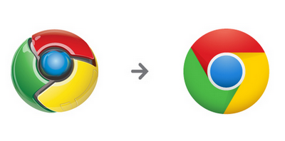
The Chrome icon has received a rather overwhelming change, moving from a 3D logo with great depth to a 2D logo with only 4 solid colors. While conceptually I like the new Chrome logo – especially Google’s explanation for keeping it simple – I think the result looks way too much like a camera shutter.

Google Camera anyone?
In all seriousness, I definitely think the new logo is more Googley whereas the last logo seemed more like the Verizon’s red “Droid” eye turned happy go lucky and started sporting less scary colors. Google also shared a bunch of random fan art, made before the logo change, that depicted the original Chrome logo in a more simple sense.

The above is one of my favorites but click here for the rest.