
You are not losing it, Google does look different. The Search Giant has changed its website’s search result design, aiming to make it cleaner and more touch-friendly. Changes to Google Search results include the following.
What changed in Google Search results?
- Removes the titles’ underlines for a less crowded look.
- Increase in font size for better visibility.
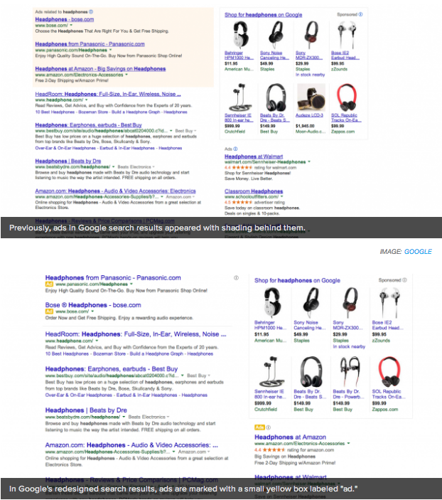
- Ads are labeled with a small, yellow icon, instead of being surrounded by a box.
It seems the biggest change was the way ads are displayed. The new design does succeed at offering a cleaner look, but ads look like they would be more easily confused with other search results. Here is an image showing the differences:
I happen to find the new design pleasing. It doesn’t seem to affect productivity in any ways and does look much cleaner. In addition, it seems to be a much more touch-friendly design.
Those of us who use touchscreen computers can attest to the fact that using the web can be hard when using your fingers to navigate. This is mostly because links are small and hard to tap.
What do you think of the new design? Love it? Hate it?
[Mashable]